
E-commerce site web design case study
Project Background
Shopping online has dominated people's purchasing experience because of its ease and convenience, including bicycle shopping. However, online bicycle shopping can be complicated because shoppers need to consider many factors into purchasing the best option.
“Geared UP” is a company that sells the high quality bikes and offers the e-commerce site that simplifies the online shopping experience to be easy and efficient.
Problem Overview
Currently, Geared Up is experiencing negative feedback
involving the low conversion rate and the poor product browsing experience.
The data from the company’s quantitative research shows that

of the users have 7 item pages open and abandon the site
without moving any item into the shopping cart
of the users place an item into a cart but abandon the cart and leave at the registration page
Designer:
Nattamon Sitthiphisai
My Role:
UX Researcher, UX Designer,
UI Designer
Key Skills:
Content Design and Strategy, Branding, Visual Design
Tools:
Figma, Miro, Google Form
Timeline:
Approximately 100 hours
Business Goal
Improve the conversion from browse to completion of checkout to increase revenue on the product’s mobile-web experience.
Potential Solutions
In order to enhance the browsing and checkout experience to greatly improve the product’s usability, I hypothesized that the site should include
-
A bike finder quiz to help users narrow down their searches to be customized and efficient.
-
A product comparison feature to help users decide the best option.
-
The guest checkout and also Google and social media sign ups to simplify the checkout process.
Approach: UX Process

Secondary Research: Competitive Analysis
I conducted the competitive analysis by studying the e-commerce industry leader websites, which are Amazon, Target, and Trek bike to gain some insights into their strengths and weaknesses in terms of usability. This process helped me in learning the industry-standard that users are familiar with and utilizing some of their key features in my designs.
Trek Bike

Amazon

Target

Primary Research: Screener Survey
I created screener survey to learn about users’ bike online shopping habits and to recruit participants who are willing to be interviewed. 18 out of 30 participants fell within the provided target user group, so these responses were analyzed.
What factor is the most important when shopping for bike online?

Primary Research: User Interview
After recruiting 5 participants through screener survey, I conducted remote user interviews to better understand users pain points and their expectation.
Insights

-
The majority would check reviews to determine the product quality
-
Interviewees would like to see the comparison feature to compare price and specs
-
The majority mentioned that it’s frustrated when the site asked to created account before purchasing
-
The extensive product description helps users decide easily
It’s frustrated when I have to open so many tabs to compare each one of them"
— Tom
If I’m at the checkout page and I have to create account, I usually leave the site"
— Akenaton
A lot of product details help me decide which bike will worth my big investment"
— Trip
Research synthesis
Affinity Map
Based on the data from both secondary and primary research, I categorized a few key features that “Geared Up” should include to improve its usability by creating the affinity map.

Meet my user: User Persona
To help me envision my potential users, I created a user persona “Garrett”. He represents the target group’s quality and personality based on my interview participants and the project’s provided.

User Journey Map
To visualize how Garrett would use “Geared UP” to find his ideal bike, I created a user journey map. This helped me empathize with what he feels and thinks about each step, and also identify the design and innovation opportunities.
Turn the challenges into opportunities
After conducting various research methods then synthesized into the simpler information, I defined the potential solutions that would help Garrett achieve his ideal bike.
Bike finder quiz
to help him find his bike easier and more efficient
Product comparison feature
to help him compare each product price and relative features
Guest checkout
to fasten and simplify the checkout process
Filtering system
to reduce time browsing for specific item
Compatible gear recommended
the returning order and increase the conversion rate
Information Architecture: User Flow
I began the design process by organizing the information into the user flow to visualize the representation of the red routes Garrett could navigate through the site.
This flow shows how he starts browsing for products, compare each product features, add an item into a cart, and complete the checkout process.
Turn concepts into tangible experiences
Wireframes
With the limited time constraint, I decided to jump start my design process to low-fidelity wireframes to turn my solution ideas into tangible experiences.
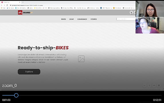
Homepage
Dedicated to helping users find and search for products they are interested

Is it going to work?
Wireframes Usability Testings
To validate my designs and discover usability issues, I recruited 5 participants who have experiences shopping online and conducted moderated usability tests.
Key Findings
-
4 out of 5 participants had no trouble finding the bike finder quiz that can be access on the top navigation bar and the lower content section on the homepage
-
5 out of 5 participants were confused by the product comparison feature and thought that the process was redundant
-
5 out of 5 participants like the extensive product information and that they can check customer reviews
-
5 out of 5 participants completed through the checkout process without any problems and like the guest checkout option
Create a consistent design: Style Guide
Before develop my wireframes to the high-fidelity designs, I created a style guide to help me unite the UI style to be consistent throughout the website

Iterate and Validate
High Fidelity Designs
Based on the first round of usability testing feedback, I iterated lo-fi wireframes into hi-fi designs to fix the usability issues and bring it to life.
Bike Finder Quiz
Allowing users to find the bike that suits their needs by simply answer a few questions


Product Comparison
Helping users compare each bike price, and relative features and suggest the best value one


Seamless Checkout Experience
Providing users with extensive product description and simple guest checkout to simplify checkout experience


Prototype and Test
To ensure that the usability issues occurred during the first round of usability test have been fixed, I conducted another round of test with 5 participants. Try my prototype below or click here
Final Usability Test Feedback
-
5 out of 5 users appreciated the bike finder quiz in helping them find their ideal bike easily
-
The majority of users found the product comparison feature useful and simple to use
-
Users were impressed by the UI and branding. They mentioned that they feel like using the real website
-
5 out of 5 participants praised the quick and delightful checkout process with many sign up and payment options
Final Iteration
To optimize the user experience, I improve some minor usability issues that participants mentioned


Takeaway
-
Always put your design out for feedback
When designing a comparison feature, I laid out each step carefully to prevent confusion. However, users pointed out that too many steps confused them. I realized that I can include action feedback in each step without requiring users do more work is the better way.
-
Recruiting specific user target group is time-consuming
I learned that working under time constraints and had to find the perfect target group for my research is challenging. In this case, I had to find someone very serious about biking and would invest in a high quality bike.
For future opportunities, I would modify the questions in a survey to be more efficient to reduce time researching. However, l was able to get some insights from participants closed to my target user group and was able to empathize with them by created a user journey map.
See more Projects

SYndee
an AI-based mobile application that helps users to overcome impostor syndrome and negative self-talk (Designed the MVP for a Startup)

Savr recipes
A mobile application that helps users learn new recipes with ease and confidence